Hat Week: The Hats of Romance Comics Explained

Hats and head-wear play an important role in romance comics. By studying the trends of the era, and using hats as signifyers we can gain understanding about social norms and the political climate in romance comics.

In other words, let's look at the crazy crap people put on their heads in the Silver Age.

Head wraps were a popular look that seems to have pretty much died out. I like it. It'd be cool to just wrap a towel around your head after you get out of the shower and not have to worry about blow-drying or flat-ironing or curling your hair.

The head wrap diminished in popularity when girls began to discover that having so much warmth around their heads affected their brains, sometimes turning them violent.

The swim cap is another obsolete head piece you'll see a lot of in romance comics.

I understand the practicality of it: you can go for a swim, but still have your hairdo looking fine when you're relaxing on the beach afterward.

But to me, those swim-hats seem to make a girl look like ol' Cabbage Head.

Men's hats are often a subtle indication of their personalities, or their likes and dislikes.

Most pervasive head-piece of the Silver Age? The headband, hands down. But there are distinct differences between the types of headbands, and the way they're worn.

There's the evening headband:

A girl's got to wear a bow to bed, in case Dennis (or Arthur or Tommy) show up in the middle of the night.

The basic headband, worn across the top of the head, is incredibly common, and indicates an average, demure, chaste girl.

But flip that thing down, and wear it across your forehead, and oh boy. That's the way hippies wear headbands, so a girl rocking that style is in for crazy, European sex parties:

And getting caught up in dangerous revolutionary politics:

Wear a headband across your forehead and you'll undoubtedly find yourself in a situation like this:

Lastly, romance comics have lead me to believe that there was some sort of baldness epidemic in the Silver Age because wig ads are everywhere.

Wigs are the hats of yesteryear. I wish I could find a hat with a built in scalp that looks like skin.

But even wigs could lead a good girl down the bad path of political rabble-rousing.

So if you're having trouble following the complex plot of an issue of Teen Age Love, Sweethearts, or Secrets of Young Brides, take a look at head-wear, and that'll clear everything right up.


John Buys Comics, Puts on Special Reviewing Hat

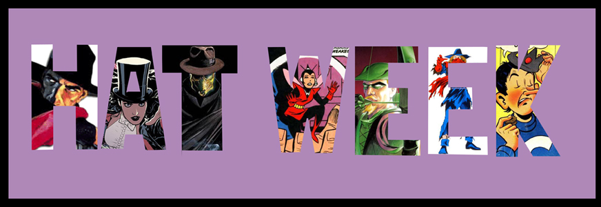
With special theme-week-appropriate rating system!

First Wave No. 1 (of 6)

Oh, what a rollercoaster ride this has been.

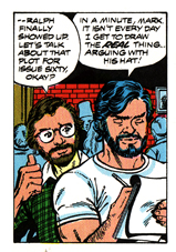
The First Wave special earlier this year, as I recall, was fun and I gave it a tentative pass. A melding of the DCU and a pulp-style setting has a hell of a lot of potential, after all. Then we had two separate waves of Post-It Previews, which are just the sort of thing to poison my mind against a project (“Brian, Just read your background material on the Blackhawks. Loved it but am concerned that it is too awesome and may blow everyone’s minds way too hard. - Dan”), so by the time this actually came out I was primed to loathe it. Hell, I almost didn’t buy it, that’s how grumpy I was about the whole thing. Happily, the quality levels of the marketing and the actual book were not at all comparable. In short: I liked this book, despite all odds.

Okay, that was a falsehood. When you have a book that features the Spirit AND Doc Savage AND a version of Batman who is also kind of the Shadow, you’re kind of starting off with me as your target audience. If you go ahead and write it really well, then you’ve got a good chance at keeping my attention, and so it’s a good thing for Brian Azzarello that he did just that. First Wave doesn’t really read like a pulp novel - a good thing, because I don’t know that it’s a writing style that would translate very well - but like some of the latter day attempts to write adventures in pulp-style worlds. Uh, by which I mean it’s a lot of fun, like most such projects are. Plus you’ve got Rags Morales knocking the art out of the park, plus there’s what I suspect to be a robot with a human brain on page four. So, yeah: four out of five hats:

Sparta: USA No. 1

Man, what is it with Wildstorm lately? Every time something like Mysterius the Unfathomable or North 40 ends, another series that scratches the same sort of itch appears. I’d like it even more if two or three of those sort of series would run at the same time, but I’ll take what I can get (the itch, by the way, is for a series that is well-written, well-drawn, has an interesting mystery at its core and is full of supernatural or science-fictiony weirdness. Hey, The Unwritten is an ongoing that fits that description, isn’t it? I’m so lucky).

The preview for this book last week was the best teaser for a comic book I’ve seen in a long time. It starts out as a description of a small American town and got just weird enough to intrigue: the folks have just a bit too much civic pride. They like football just a bit too much. There’s a hint of menace here and there, where there shouldn’t be, and then at the end there’s mention of a yeti. Five pages and DC had made a sale, though as it was just the first five pages of the comic I guess I should credit David Lapham and Johnny Timmons more than anyone.

This is the sort of comic that I form a deep attachment to on first read - I know that all of the weirdness associated with the town of Sparta will be explained in good time an am pretty sure that the process is going to be joyful. Five hats.

Age of Reptiles: The Journey No. 3 (of 4)

Richard Delgado has a bit at the end of these issue where he talks about falling in love with dinosaurs as a kid, and this issue focuses on how fascinated he was with the dinosaur paintings of Charles R. Knight. That’s precisely right - this series even more than the prior [Age of Reptiles] books feels like a study of a collection of actual animals, just like all of the pictures that I used to pore over in my dino books. The storytelling on the cover alone just sucked me in for a couple of minutes, for heaven’s sake. I’ll be getting a copy of this for my nephew, once I’m sure that he’s past book-destroying age. Five hats.

Nemesis: the Impostors No. 1 (of 4) - Though RUN! was the most viscerally pleasing of the Final Crisis Aftermath series, I reckon that Escape was the best book over all. It did, however, leave a huge number of questions hanging in the air. Will this series clear anything up? Let’s decide in a SECOND ISSUE OF JUDGEMENT. In the meantime: three hats, the hat-equivalent of one eyebrow raised expectantly.

Adventure No. 8 - Okay: the first issue of Adventure under a new creative team without crossover bullshit to contend with! How’d they do? Let’s see… Legion of Super-Heroes stuff: good times. Legion Espionage Squad, Mon-El and Superboy stuff: also good times, and the first two parts look like they’ll come together into a Brainiac beat-down in good order. General Sam Lane and Project 7734? HAS TO END. SO BORING. SNORE.

I guess that makes this issue two-thirds good, which I’ll say is three hats.

Astro City: Dark Age Book Four No. 2 - Astro City books get five hats even when I’m not using a hat-based rating system, that’s how much I love them. And this issue features Las Vegas’ super-hero, who is named Mirage and has neon sign powers. I weren’t so lazy I’d make another graphic and give this book six hats.

Sweet Tooth No 7 - Okay, next issue has got to be the one where Sweet Tooth wakes up and he’s still with Mr. Jessup and then Mr. Jessup teaches him to play hockey. And then a kitten. Four tear-stained hats.

*doffs hat* Good night everybody!


HAT WEEK: HATS!

hatweekbanner.jpg

In celebration of HAT WEEK, I am going to take a look at some very real super hero hats that you can buy and wear (though I would not recommend it).

First we have a Superman cap plastered with Jim Lee artwork. This hat blatantly ignores the "less is more" philosophy:

"SO, DO YOU LIKE SUPERMAN?"

"SO, DO YOU LIKE SUPERMAN?"

And if Superman isn't your thing, but you are still into hideous hats and Jim Lee artwork, the cap also is available in Batman:

"HAVE YOU EVER READ HUSH, BRO?"

"HAVE YOU EVER READ HUSH, BRO?"

This next hat seems like a pretty straightforward, though still terrible, Death of Superman hat:

NEVER FORGET.

NEVER FORGET.

Except wait! It's not that at all! It's actually part of a series of hats featuring superhero logos that have been splattered in paint:

THE FLASH CAN OUTRUN EVERYTHING...EXCEPT A BUCKET OF PAINT.

THE FLASH CAN OUTRUN EVERYTHING...EXCEPT A BUCKET OF PAINT.

Of course there are plenty of Dark Knight Joker hats, none of which should be worn by anyone:

I'M NOT SURE WHO THINKS THEY CAN PULL THIS OFF, BUT THEY ARE WRONG.

I'M NOT SURE WHO THINKS THEY CAN PULL THIS OFF, BUT THEY ARE WRONG.

"HMMM...I THINK I'LL WEAR MY FORMAL DARK KNIGHT JOKER CAP TONIGHT."

"HMMM...I THINK I'LL WEAR MY FORMAL DARK KNIGHT JOKER CAP TONIGHT."

NEVER FORGET.

NEVER FORGET.

There's a confusing series of Marvel hats that feature other Marvel logos with Wolverine slashes through them. I guess it's like the Marvel equivalent of having Calvin peeing on a Chevy logo:

HAHA! FUCK YOU, FANTASTIC FOUR!

HAHA! FUCK YOU, FANTASTIC FOUR!

SPIDER-MAN? MORE LIKE SPIDER-DICK!

SPIDER-MAN? MORE LIKE SPIDER-DICK!

This is a very intense movie Batman hat that just looks insane to me. Although if I were talking to someone who was wearing it, I would probably be staring dreamily at their forehead the whole time:

"HELLO RACHELLE. PAY NO ATTENTION TO THE NERD BELOW ME. YOU NEED ONLY SPEAK TO ME."

"HELLO RACHELLE. PAY NO ATTENTION TO THE NERD BELOW ME. YOU NEED ONLY SPEAK TO ME."

This hat is, for real, just straight up awesome:

IF I WORE BALLCAPS, I WOULD WEAR THIS ALL THE TIME.

IF I WORE BALLCAPS, I WOULD WEAR THIS ALL THE TIME.

This hat is straight up terrifying:

"I'M LOOKING FORWARD TO OUR BLIND DATE. I'LL BE THE ONE WEARING CAPTAIN AMERICA'S HEAD ON MY HEAD.

"I'M LOOKING FORWARD TO OUR BLIND DATE. I'LL BE THE ONE WEARING CAPTAIN AMERICA'S HEAD ON MY HEAD.

Hey, I know there's really no limits to how tacky your Punisher merchandise can be. But if there were a limit, I would say this hat is dangerously close to it:

"AW MAN, THE PUNISHER IS SO FUCKING DOPE. HE, LIKE, SHOOTS SHIT AND SHIT."

"AW MAN, THE PUNISHER IS SO FUCKING DOPE. HE, LIKE, SHOOTS SHIT AND SHIT."

"AND HE'S GOT A SKULL ON HIS SHIRT. HE'S EVEN COOLER THAN VENOM."

"AND HE'S GOT A SKULL ON HIS SHIRT. HE'S EVEN COOLER THAN VENOM."

And finally, Superman would never wear this:

UNLESS BATMAN TOLD HIM TO.

UNLESS BATMAN TOLD HIM TO.

When Heroes Accessorize!

 From the ashes of Fat Week, it’s Hat Week here at Living Between Wednesdays! I’m a bit fuzzy on how this whole theme came about—I feel fairly certain that alcohol may have been involved. I do know that the logical progression of Fat Week leading to Hat Week means that next week will be Cat Week. I still have no idea what I’ll be writing about for that. For now, though, this week will all be about stylish headgear. I came to my topic for this theme pretty quickly, when I remembered an awesome issue of the old Marvel Two-In-One series—issue #60, to be exact, cover dated February 1979. I have this story in the old The Thing: Project Pegasus trade paperback, although I don’t think it appears in the newly-issued hardcover of the same storyline. Which is a shame, because it’s great fun in the old-school Mighty Marvel Manner. This was an especially great run on this book, with the Project Pegasus storyline on one side of this issue and the Counter-Earth saga and The Serpent Crown Affair on the other side of it.

This story, titled “Happiness Is A Warm Alien!” (by writers Ralph Macchio and Mark Gruenwald, and artists George Perez and Gene Day) sees Benjamin J. Grimm, AKA the ever-lovin’ blue-eyed Thing, getting ready for a fancy gallery show of his gal Alicia’s latest sculptures. Ben gets ready for the show with a shower, only to be interrupted (in a fun Psycho homage) by Fantastic Four associate the Impossible Man. This shape-shifting weirdo from the planet Poppup is looking to be entertained for the evening, so he gets the night off to a slightly invasive start by disguising himself as Ben’s towel. Can you imagine if Ben had decided to use that towel to dry off his nether regions before he realized what was going on? I’ll bet ol’ Impy wouldn’t try that gag again.


Impossible Man really wants to hang out with his rocky orange pal that night, but Ben insists that the presence of a pointy-headed green alien will freak out the guests of the SoHo gallery show. Y’know, more so than a seven-foot tall muscleman made out of bright orange rocks in a tuxedo. However, I.M. comes up with a novel solution:


Hilarity ensues when the duo take to the streets, and the excitable extraterrestrial can’t settle on a shape. One imagines that a sight like this would attract attention regardless, but the tabloid press probably had a field day with this.


I can’t decide which one is funniest—the Davy Crockett or the moose antlers. As an aside, I’d like to add that George Perez probably draws my all-time favourite version of the Thing. He’s just very expressive and lovable. Dig that expression in the panel where’s he’s wearing the Mickey Mouse hat (does this mean that the Marvel/Disney deal was written in the stars or something?).

 The whole night might be in jeopardy when the trio takes a shortcut down Yancy Street, smack in the middle of a strip of turf belonging to a certain gang that has it in for Aunt Petunia’s favourite nephew Benjy. Thankfully, this might be the one time where it pays to be wearing a sentient, shapeshifting hat:


The remainder of the story involves a trio of thugs that Ben put away in an old issue of Strange Tales who transfer their minds into Alicia’s statues of supervillains in order to get revenge. Ben and Impy shut them down pretty easily, but not before a few familiar faces from the Marvel Bullpen make an appearance. It’s meta before meta was a thing!


Not shown: the Yancy Street Gang pouring one on the curb for their dead homey who took a brick in the face.

Herbie Popnecker: King of Fat Week

What would Fat Week be without an entry about Herbie Popnecker? Pretty slim, I'd say.

If you haven't read the Darkhorse Herbie Archives that chronicle the meger twenty or so brilliant issues of Herbie—get on it! This comic is phat! Large! A HUGE SUCCESS! Ok, I'm done.

But seriously, Herbie is absurd and surreal, with laugh-out-loud hilarious moments. And the pristine silver age art just adds to the strangeness of it. Such weird and wonderful stuff.

If you're not familiar with Herbie Popnecker, I'm going to provide a pictoral tour through Herbie Archives volume 2 ('cause that's the one I have on hand), so you can get to know him. If you are familiar with Herbie, feel free to post your favourite Herbie memories or your Herbie fanfic.

So, Herbie:

Herbie is more hip than happy. And by, "hip" I mean, "fat."

He speaks in a curt monotone, like he just can't be bothered to use articles when he says anything.


This is one of the reasons why Dave came to the conclusion that Herbie may have been Alan Moore's inspiration for Rorschach.  Herbie is a sort of anti-hero, an abrasive, sardonic fat kid, who you eventually can't help but root for.

He's inexplicably famous, he can time travel, and every woman alive is voraciously attracted to him.

His Dad's a total dick, but that don't bother Herbie none. 


But the best part is, Herbie is unapologetically fat. He loves his lollies and feels no shame about it.


 Herbie's no yo-yo dieting Kirstie Alley.

Dude calls his superhero alter ego THE FAT FURY! That's some serious plump pride.

One time, Herbie went to Canada, and it was possibly less confusing than when the Archies did. It also resulted in this panel:

In honour of Fat Week, I'll leave you with a montage of Herbie getting some serious play.


 P.S. Living Between Wednesdays contest: the first person to get this tattoo...


 ...wins my undying love and respect.